The Power of the Pareto Chart in Problem Solving: A Guide to the 80/20 Rule
Credits: Six Sigma Manufacturing
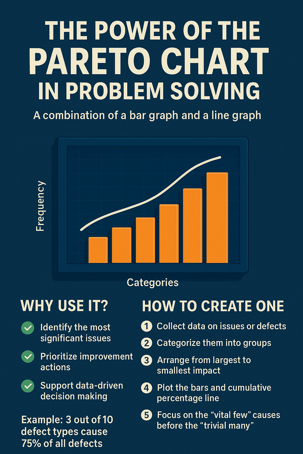
When it comes to problem solving and quality improvement, the Pareto Chart is one of the most effective tools. Based on the Pareto Principle (80/20 Rule), it reveals that 80% of problems often come from just 20% of causes.
This makes it an essential tool in Six Sigma, Lean manufacturing, and business productivity strategies, as it ensures teams focus on what really matters.
🔹 What is a Pareto Chart?
A Pareto Chart is a graphical quality tool that combines:
- Bar Graph: Shows the frequency or impact of issues in descending order.
- Line Graph: Displays the cumulative percentage across categories.
This combination helps identify the “vital few” causes that contribute to most problems, separating them from the “trivial many.”
🔹 Why Use a Pareto Chart?
Here are the key benefits of using a Pareto Chart in problem solving and process improvement:
✅ Identify the most significant problems
✅ Prioritize improvement efforts
✅ Support data-driven decision making
✅ Improve productivity and efficiency
✅ Enhance quality in manufacturing and business processes
🔹 How to Create a Pareto Chart (Step by Step)
1️⃣ Collect data on issues, defects, or complaints
2️⃣ Categorize them into groups
3️⃣ Arrange the categories from largest to smallest impact
4️⃣ Plot the bars (frequency) and cumulative line (percentage)
5️⃣ Focus first on the vital few causes before addressing the trivial many
📊 Example of a Pareto Chart in Action
Imagine your production line has 10 different defect types.
After analysis, a Pareto Chart reveals that just 3 defects account for 75% of all issues.
By fixing those top issues first, you achieve faster problem solving, higher productivity, and improved quality.
💡 Pro Tip
Use Pareto Charts regularly in your Six Sigma projects, Lean manufacturing improvements, or quality audits.
They make your process improvement strategies smarter, more effective, and more impactful.
Final Thoughts
The Pareto Chart is more than just a graph—it’s a problem-solving powerhouse. By applying the 80/20 Rule, you can reduce defects, cut costs, and boost efficiency in any process.
If you want to improve quality and productivity in your business, the Pareto Chart should be at the top of your toolkit.
